


Spring... Summer... Fall... Holiday... Each of the four seasons in a Paul Fredrick calendar year has its own particular colors and color schemes. There are, of course, tones that transcend these periods and are popularly worn year-round: basic white and black are two examples that are generally considered ‘evergreen.’ The building blocks of color are very important throughout; we in essence see the same colors - red, purple, yellow, orange, green, and blue - repeated every season. What changes, though, is the variation in each hue that we match to the appropriate season. Let’s look at these variations for Fall 2016!
Sage + Slate Blue
Sage and slate blue (sometimes substituted with light blue) is a color combination that is probably the most quintessentially Fall of any you could name. Sage is a green color that has been somewhat muted thanks to an infusion of grey. It’s considered a grounded hue because it closely resembles what one might see in nature, which makes this tone very wearable in a number of different settings.
Slate blue is a similarly relaxing color, and the analogous relationship between the two hues makes for a very pleasant combination. To complete your look, choose from other shades of blue and green – navy or denim pants go especially well with this scheme. Other grounded tones like brown or tan will also work; as a highlight, try wine!
Royal Blue + Yellow
Blue is an outstanding ingredient for any season, but it’s particularly wonderful for Fall. To this end, we’ve taken advantage of this shade in all its glory, from electric to ethereal sky blue. Royal blue is one of our favorites; it provides a much-needed contrast to the deep tones and harvest colors that are utilized so pervasively in Fall stylings. Add yellow to the equation and you’ve got two of the three primary colors. However, using more than one primary color in its original state can be overstimulating, so use a softer yellow or a deeper blue to balance out this effect. This combination can be complemented by navy or brown and accessorized with gold. Just remember to keep the rest of your look toned down to really let these colors shine.
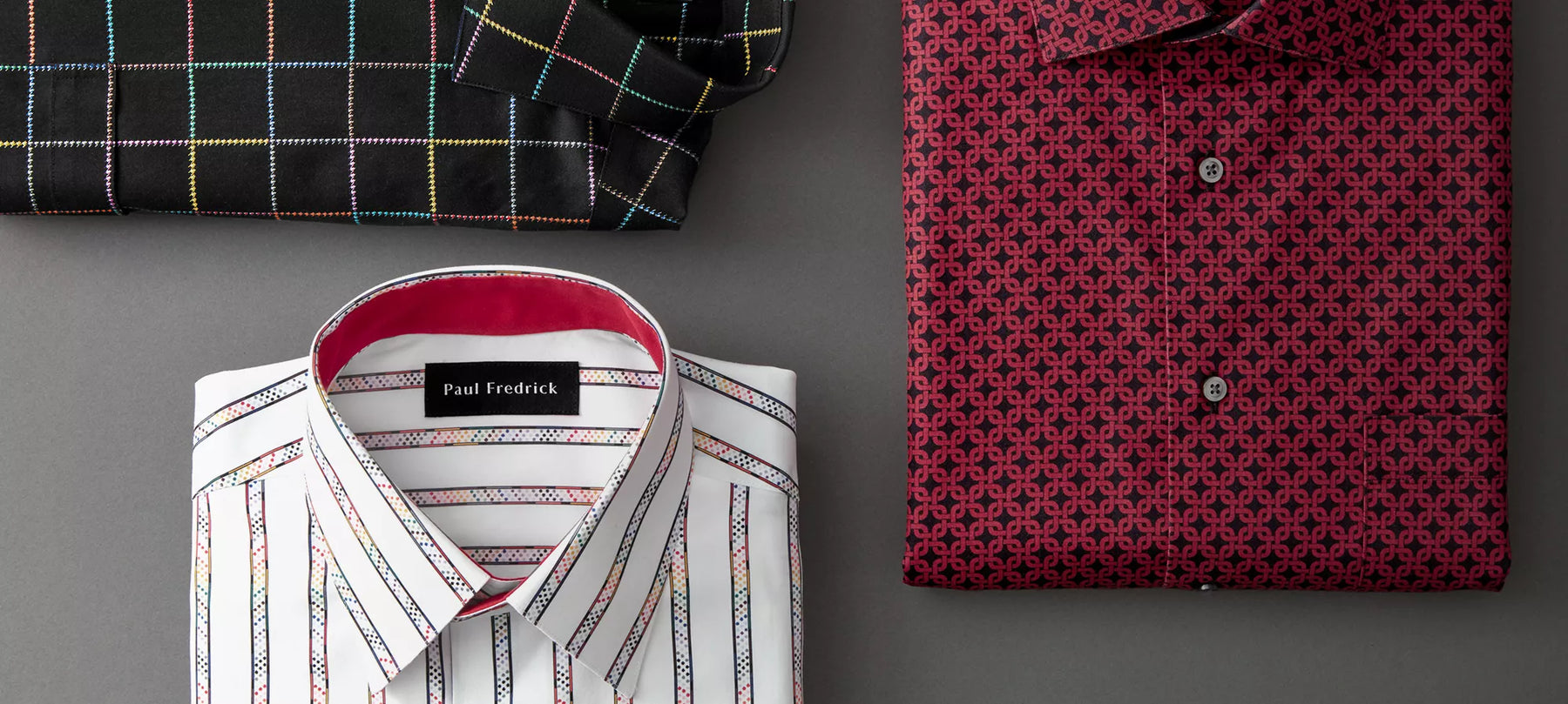
Merlot + Khaki
During the Fall and Holiday seasons, jewel tones rule. Merlot, a marvelous purplish-red hue, is a favored jewel tone for Fall. It can vary from more red in color to a deep purple, almost brown tone. Considering this visual relation to brown, it is not surprising that merlot has found its match in khaki. Neutral khaki is a perfect complement to saturated merlot, and the combination achieves a sort of harmony, sartorially speaking. It’s an excellent way to wear a jewel tone in an everyday setting! Merlot and khaki pairs well with blue, or pair it with black for an especially sophisticated look. If you should wish to accessorize, go with gold.
Are there any combinations you think we missed? Which ones are your favorite?